Make it unmistakable
I want to show you a cart screen that most designers would call clean.

A clean cart page UI.
One item in your cart just went out of stock, so the screen dims it a little, greys out the checkout button, and drops a quiet line at the bottom that says some items are unavailable. Nothing's yelling at you, nothing's cluttered, it looks calm and kind of tasteful. It's also completely broken.
Because now you're standing there doing the one thing an interface should never make you do, which is hunting. Which item? Why? What am I supposed to do about it? The screen knows all three answers, it just decided not to say them.
This is the trap most of us fall into. We've been taught that clarity means less... strip it down, remove until it breathes, let the whitespace do the talking. So we reach for restraint on the exact screens where restraint is the problem. That out-of-stock cart doesn't need less, it needs to grab you and point.
Here's the reframe I keep coming back to. Don't design for clarity. Clarity is a soft word, you can talk yourself into believing almost anything is "clear enough." Design for something you can't argue your way out of instead. Design so it's unmistakable.
Something unmistakable is so obvious it can't be confused for anything else. Not "clear to me, the person who built it and stared at it for 3 weeks." Clear to the tired person on a small screen with about 3 seconds and a kid pulling their sleeve. That's a claim about their head, not about my taste, and it's a much higher bar to hit.
And here's the part that feels backwards... getting there usually means adding, not subtracting. The fix for that broken cart isn't a cleaner layout, it's more signal. An icon, a color, a label, a button, all saying the same thing at once. The clean version was the confusing one the whole time.
The idea
Think about an ATM for a second. When your card's still in the slot it doesn't just put a message on screen, it beeps, it flashes a light, and it says it in words too, all at the same time, all pointing at one single thing... take your card. 3 channels, one message. Nobody in the history of ATMs has been confused about this.
That's the whole move. You don't make something unmistakable by saying one thing louder, you make it unmistakable by saying the same thing a few different ways at the same time.
Unmistakable = One Message × Many Channels
Color, shape, position, words, motion. Those are your digital channels. Stack them behind one message and the thing becomes impossible to miss.
There's a catch though, because "many channels" sounds like permission to just pile stuff on, and that's not it. A new channel carrying the same message adds clarity. The same channel again just adds noise. Two banners isn't clearer than one banner, it's just two banners.
Reinforcement ≠ Repetition
So the question I end up asking on any screen is pretty simple... is everything here saying the same one thing? And is it loudest exactly when it matters, then out of the way when it doesn't?
What a screen owes you
Any screen is really answering three questions, in order:
Status → Priority → Direction
What's happening → what matters most → what do I do about it. Most screens answer the first and drop the other two. Priority is the one everyone skips, and it's usually where things break, because a screen can be full of correct information and still leave you stuck when nothing on it is louder than anything else.
The same cart, three ways
So I took one cart and approached it three times. Same items, same problem... a couple of things went out of stock. Each version just does a little more to make that impossible to miss than the one before it.

Level 1 — it hides the problem
Level one is the clean one, and it's the one most apps actually ship. The out-of-stock items are sitting right there in your cart, but they look exactly like everything else. Same size, same weight, full color. There's a tiny "out of stock" line tucked under each one and that's the whole signal. Nothing's dimmed, there's no banner, nothing pulls your eye. And they're scattered wherever you happened to add them, one in the middle, one at the bottom, so you don't even clock that there are two of them. It looks tidy. It's also the version where you walk straight into a dead checkout button with no idea why. Clean, and useless.

Level 2 — it points to the problem
Level two starts pointing. A line shows up at the top telling you something needs sorting, with a button that takes you straight to it. And the cart quietly reorganizes... the stuff you can actually buy floats up top, the out-of-stock items collect at the bottom, and a red bar runs down the edge of the screen next to them so your eye catches it even mid-scroll. Now the problem has an address. It's not hiding anymore. You still have to travel down to deal with it, but at least you know exactly where "down" is.
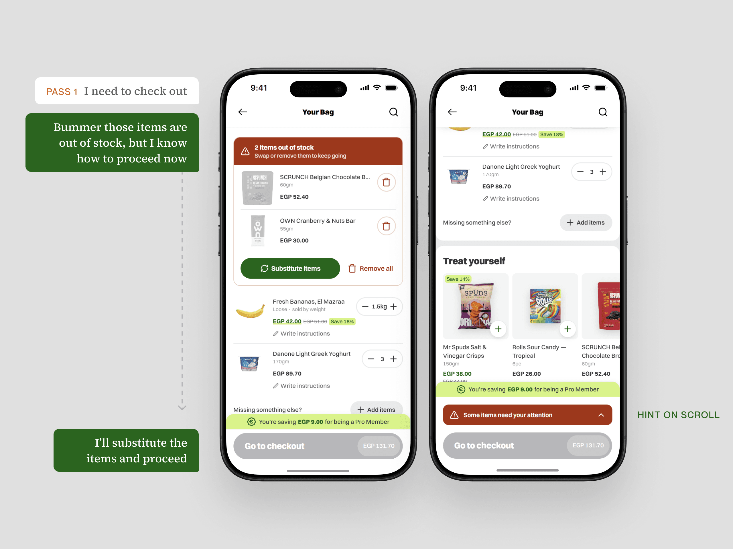
Level 3 — it brings the problem to you
Level three brings the problem to you. The out-of-stock items jump to the very top in their own box, with a red header that just says it, two items out of stock, and the fix sitting right underneath. Substitute, or remove, done. Scroll past it and a red bar slides in above the checkout button so you can snap right back up. You don't hunt and you don't wonder... the second the screen loads, the loudest thing on it is the thing standing between you and checkout. That's the whole idea living in one screen. Color, position, an icon, a header, and a nudge that follows you down the page, all saying the same single thing.
So
The clean cart we started with wasn't clarity, it was just quiet. What made the good version work wasn't less, it was every single element finally saying the same thing.
Clean is what a screen looks like. Unmistakable is what it does to the person reading it.